
Building Responsive Layouts That Work
Master the fundamentals of creating flexible grids, fluid images, and media queries that adapt to any screen size.
Read MoreLearn how to build responsive websites that work seamlessly across all devices. Discover the principles, techniques, and best practices for modern mobile-first design in today’s digital landscape.
Explore Articles
In-depth guides covering mobile-first design principles, responsive strategies, and practical implementation techniques.
Master the fundamentals of creating flexible grids, fluid images, and media queries that adapt to any screen size.
Read More
Learn how to write effective media queries and choose the right breakpoints for tablets, phones, and desktop screens.
Read More
Understand touch targets, gesture navigation, and how to optimize user experience specifically for mobile device interactions.
Read More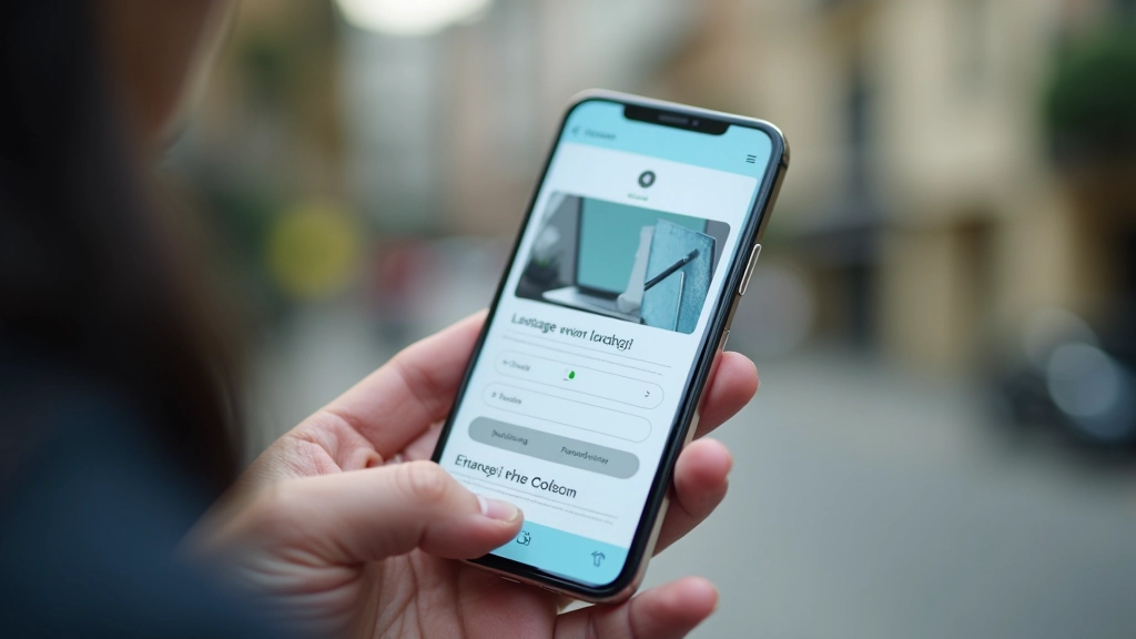
Techniques for reducing file sizes, lazy loading images, and ensuring your site loads quickly on slower connections.
Read MoreThe foundation of effective responsive design starts with understanding these key concepts.
Start your design with mobile constraints in mind. Build up to larger screens rather than scaling down from desktop. This ensures essential content and functionality are prioritized.
Employ CSS Flexbox and Grid systems that adapt to different viewport sizes. Avoid fixed pixel widths and instead use percentages and relative units for maximum flexibility.
Serve appropriately sized images based on device capabilities. Use modern image formats, responsive image attributes, and compression techniques to reduce load times.
Build a solid mobile foundation, then enhance the experience for larger screens. Ensure core functionality works without JavaScript and improves with progressive enhancements.
“Mobile-first isn’t just about smaller screens — it’s about rethinking how people interact with your content. When you design for mobile first, you’re forced to make better decisions about what matters most. Everything else follows naturally.”
More than 60% of web traffic now comes from mobile devices. Users expect fast-loading, easily navigable websites on their phones. Mobile-first design isn’t optional — it’s essential for reaching your audience effectively.
By prioritizing mobile experience, you’re not limiting yourself to a smaller screen. You’re creating a foundation that scales beautifully across all devices. Responsive design becomes simpler, maintenance becomes easier, and your site reaches more people.