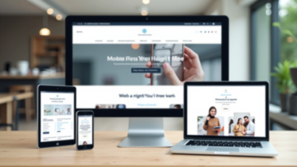
Mobile-First Design Leadership in Malaysia
We’re MobileFirst Malaysia Sdn Bhd. Since 2018, we’ve been helping businesses craft responsive web experiences that work beautifully on every device.

How We Build Digital Experiences
Mobile-first isn’t just a buzzword for us. It’s the core principle that guides every project we touch.
Most businesses still design for desktops first, then shrink everything down for mobile. We don’t do that. We’re building for the 70% of your users who’re on phones. The responsive strategy comes naturally when you start with mobile constraints.
That means faster load times. Cleaner interfaces. Better conversions. It’s not rocket science—it’s just the right way to design in 2026.
Mobile First, Always
We design the smallest screen experience first, then enhance for larger devices. It forces clarity and prioritization.
Performance Matters
Every design decision we make considers how it’ll load on 4G networks. We’ve seen too many beautiful designs fail because they’re slow.
Touch-Friendly Design
Buttons big enough to tap. Spacing that prevents accidental clicks. Navigation built for thumbs, not mice.
Accessible to Everyone
Responsive design isn’t just about screen size—it’s about reaching everyone. We follow WCAG standards on every project.
Responsive Strategies That Stick
We don’t just build websites. We craft responsive strategies tailored to how your audience actually uses the web.
Mobile Strategy Audit
We analyze your current site—how it performs on mobile, where users struggle, what devices your audience uses most. Then we build a roadmap.
Responsive Redesign
Complete rebuild using mobile-first methodology. Flexible grids. Fluid images. Media queries that work. Your site feels native on every screen.
Performance Optimization
Responsive design that’s also fast. We optimize images, minimize code, implement lazy loading. Your mobile users won’t wait.
Testing & Validation
We test across 50+ devices and browsers. No surprises. We validate that your responsive site actually works everywhere.
Ongoing Support
New devices release constantly. We monitor your site’s responsiveness and update CSS, images, and scripts as needed.
Team Training
We teach your team how to maintain mobile-first design. Documentation. Responsive design patterns. Best practices for CSS and layout.
Why Responsive Design Matters in Malaysia
Malaysia’s internet landscape is mobile-heavy. More than 85% of users browse on phones. Your desktop-first site? It’s cutting off most of your audience.
We’ve worked with e-commerce brands, SaaS companies, and local services. Every single one saw better conversions after going mobile-first. Faster pages. Higher engagement. Lower bounce rates.
MobileFirst Malaysia Sdn Bhd has helped over 150 businesses build responsive web experiences since 2018. We don’t believe in one-size-fits-all solutions. Your industry has unique needs. Your users have specific behaviors. Your mobile strategy should reflect both.

Our Journey
How we’ve evolved as mobile web design has transformed the industry
2018
We launched MobileFirst Malaysia Sdn Bhd with a simple mission: help Malaysian businesses understand responsive design. Most were still stuck in the desktop era.
2019-2020
Mobile traffic accelerated. We started seeing real results—sites we redesigned saw 40% more mobile conversions on average. We refined our process, built templates, trained our first full team.
2021-2022
Core Web Vitals changed everything. We pivoted hard toward performance. Mobile-first design plus lightning-fast load times became our signature. Google’s algorithm rewarded it.
2023-2024
We’ve been focused on edge cases. Foldable phones. New screen sizes. CSS innovations like container queries. Staying ahead of what’s coming next.
2025-2026
Today, we’re helping businesses build responsive strategies that’ll work for the next decade. We’re not just designing for mobile—we’re designing for whatever comes next.
Important Information
The information presented on this website is intended for educational and informational purposes only. While we provide insights and strategies based on industry best practices and our experience with responsive web design, individual results depend on many factors including your specific business model, target audience, technical infrastructure, and implementation approach. We recommend consulting with qualified web development professionals to assess how these strategies apply to your unique situation. Past project outcomes don’t guarantee future results, and web technologies continue to evolve rapidly.